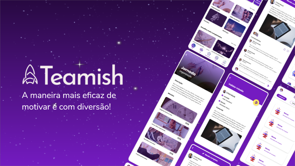
Teamish is a gamified application for team motivation and engagement, which was designed based on the need for social distancing due to the global pandemic, but made its mission timeless by being able to engage and motivate at any time and distance.
My jobs
UX Designer UI Designer Graphic designer Digital ads
Case challenge
I joined as the sole designer in the project already underway and I didn’t know the conditions of your current state.
Start
Carry out a complete diagnosis to understand current conditions of the project without disturbing your progress that was already in the beta.
Diagnosis result
There was no documentation about discovery and ideation processes.
There was no record of personas, user journeys.
The project did not have a consistent standard regarding:
color palette, componentization, assets, typography.
Outdated mockups, prototypes, and flows.
There was no guidance or criteria regarding the tests.
Decisions and post-diagnosis process
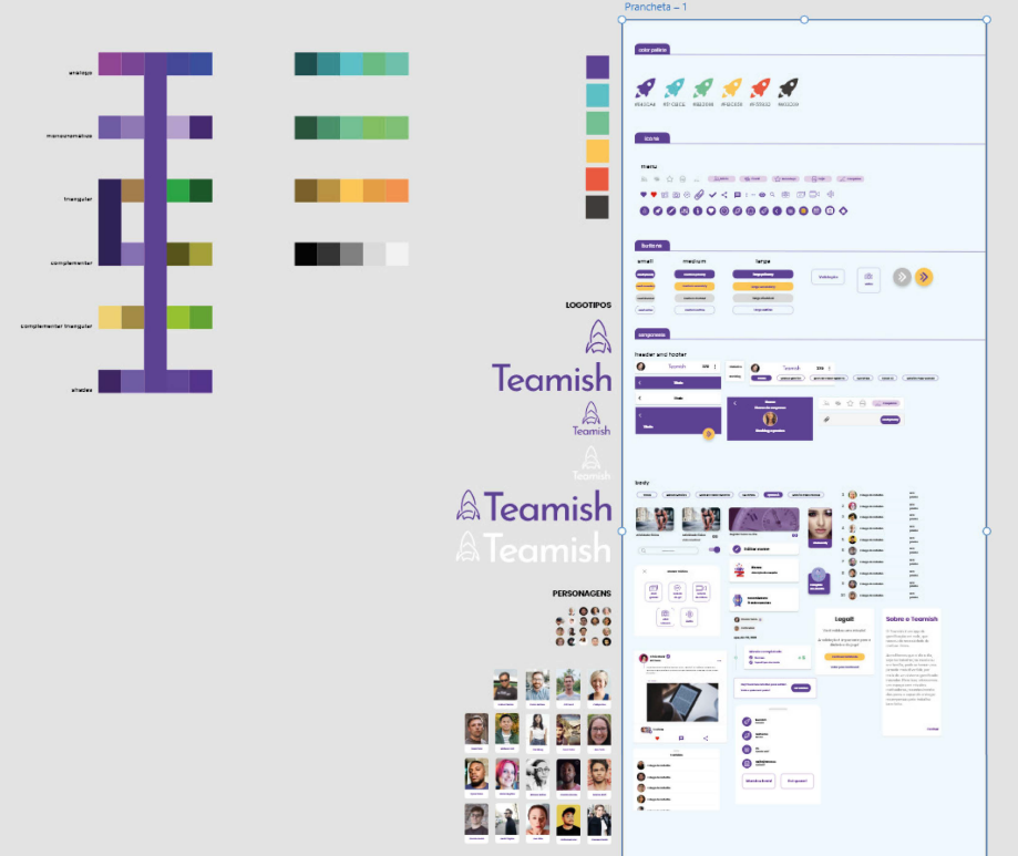
Create color palette
Set typography
Vectorize icons
Reassemble the components
Reassemble mockups with the updated components
Redo flow map
UI Kit assembly
Perform heuristic analysis
Usability microtest
Create presentation
Create commercial proposal
Create a promotional video
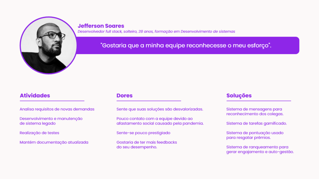
Persona
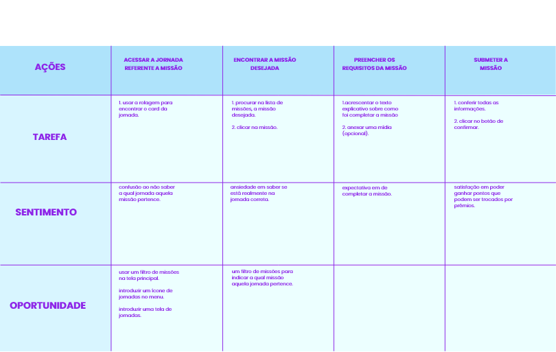
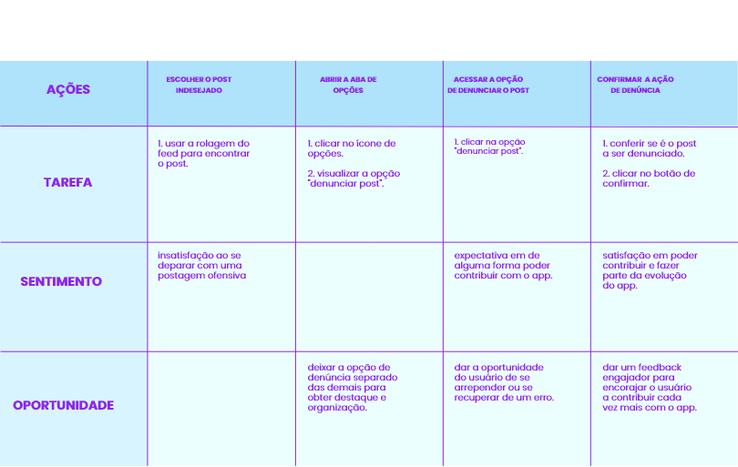
User journeys
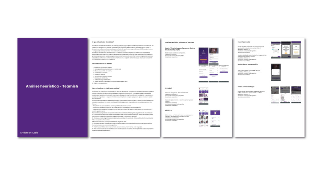
Heuristic analysis
After the diagnosis, a heuristic analysis was carried out on the app followed by a report to correct the most serious errors and to guide the reformulation that would follow.
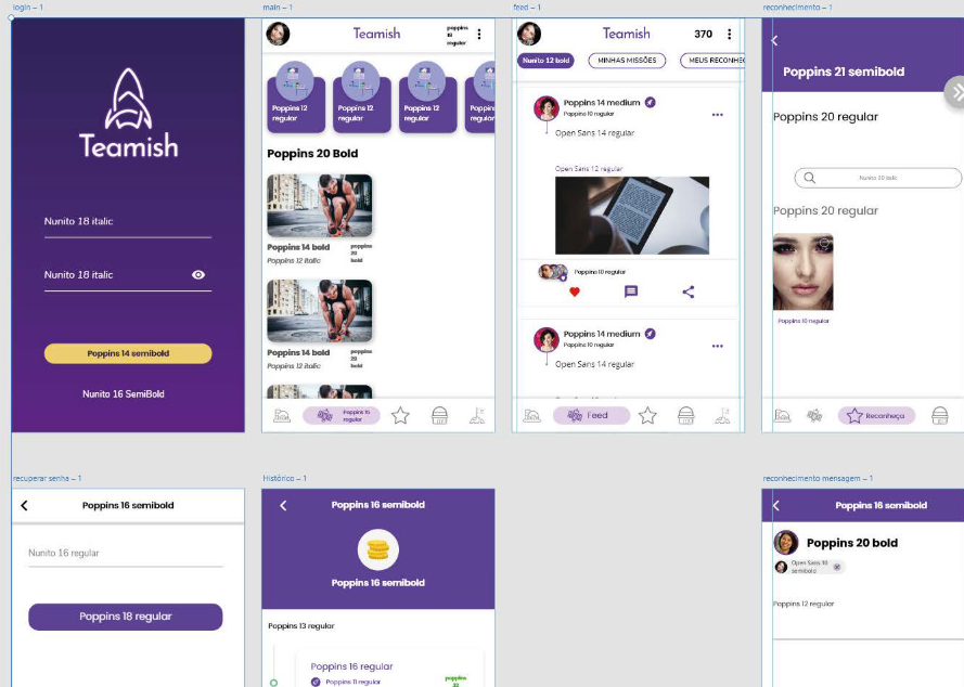
Typography mapping
After mapping, it was discovered that the app had 3 typographic families plus two separate types, totaling more than 20 different types.
So it was decided to opt only for the Nunito typographic family.
Componentization
At this time, the atomization of elements was also adopted, thinking about the possibility of creating a design system in the future.
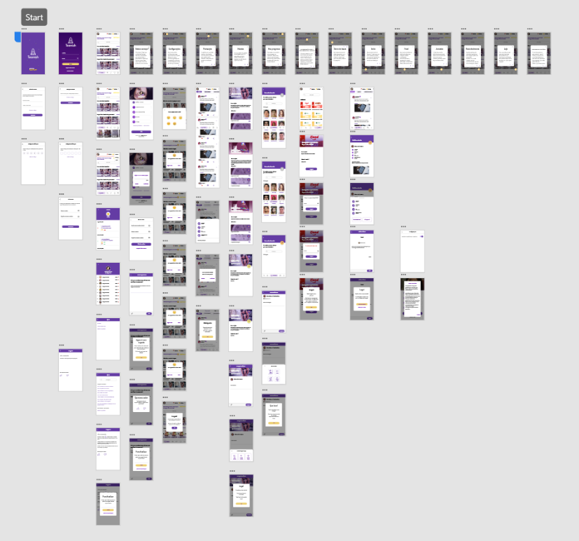
Mockups and flow
With all the components redone and standardized, it was time to redo the mockups in high fidelity, adding interactivity to the flow.
What I learned
The process does not always go as planned.
Sometimes you have to look at the bigger picture before breaking down your goal in parts.
The next steps
Process improvements.
Permeate UX culture across the entire team and company.